Simple Things You Can Do to Improve Your eBay Listings (Increase Sales)
If you have found yourself in the situation where you used to sell more than you currently do, it's time to take a look at the actual listing (template) you are using on eBay. Some simple changes can make a huge difference in sales!
First, get modern. If you have been selling on eBay for a long time you are likely sill employing many listing techniques that are now outdated. It’s super easy for us long-time-sellers (almost 16 years here!) to not “get modern” because we are so accustomed to what we have been doing for a decade or more. Here’s some super important info for you:
FACT: CELL PHONES ARE USED TO SHOP… EVEN MORE THAN DESKTOPS!
It used to be ok, and even encouraged, to use bright colored listing templates in addition to funky fonts, colored fonts and even little animated GIFs. While this was super cool and trendy back in 2015 when everyone shopped from their desktop computer, it is now a serious complication in 2020 because it makes the listing super hard to read on a tiny cell phone screen.
If you are reading this blog post on a cell phone, check this out:
This is 10 point font
This is 12 point font
This is 14 point font
This is 16 point font
This is 24 point font
This is 30 point font
Now let's look at 14 point font in different colors.
Is this easy for you to read? Would you want to read a paragraph of product details in this color? This is true yellow colored font on white background. Not easy to read, eh?
Is this easy for you to read? Would you want to read a paragraph of product details in this color? We can probably agree that orange is easier to read than yellow, but did you know that orange is one of peoples "most disliked" colors? Yes, seriously!
Is this easy for you to read? Would you want to read a paragraph of product details in this color? In my opinion, this is damn-near impossible to read due to the lack of contrast.
Is this easy for you to read? Would you want to read a paragraph of product details in this color? Pea green? Seriously?
Is this easy for you to read? Would you want to read a paragraph of product details in this color? Def much easier to read that yellow, orange, light blue or pea green. This is a good secondary color, if needed.
Is this easy for you to read? Would you want to read a paragraph of product details in this color? I hate it.
Is this easy for you to read? Would you want to read a paragraph of product details in this color? I am seriously squinting right now to type this!
Now imagine if you use this color and also 10 point font for your eBay listing... does this explain why you might be losing out on sales? Or, what if you are using insane 30 point font with this same color. Does this make sense? This also seems very difficult to read even though the font is indeed larger.
Lastly, Is this easy for you to read? Would you want to read a paragraph of product details in this color? Hell yes! Winner, winner chicken dinner! Basic = Best in this case!
The most popular colors for font are true back and charcoal. Supposedly charcoal is supposed to be "easier on the eyes", but I personally prefer true black. This blog that is part of our eCommerce site is set for Charcoal. I try to change it to black whenever I remember.
The absolute best thing you can do to accommodate your cell phone shoppers is go back to the boring white page with black traditional text. 12-point-font is a MINIMUM. Most web designers now encourage 14-point font specifically so it is easier to read on small screens. Here's an example of an eBay listing not formatted for cell phones:
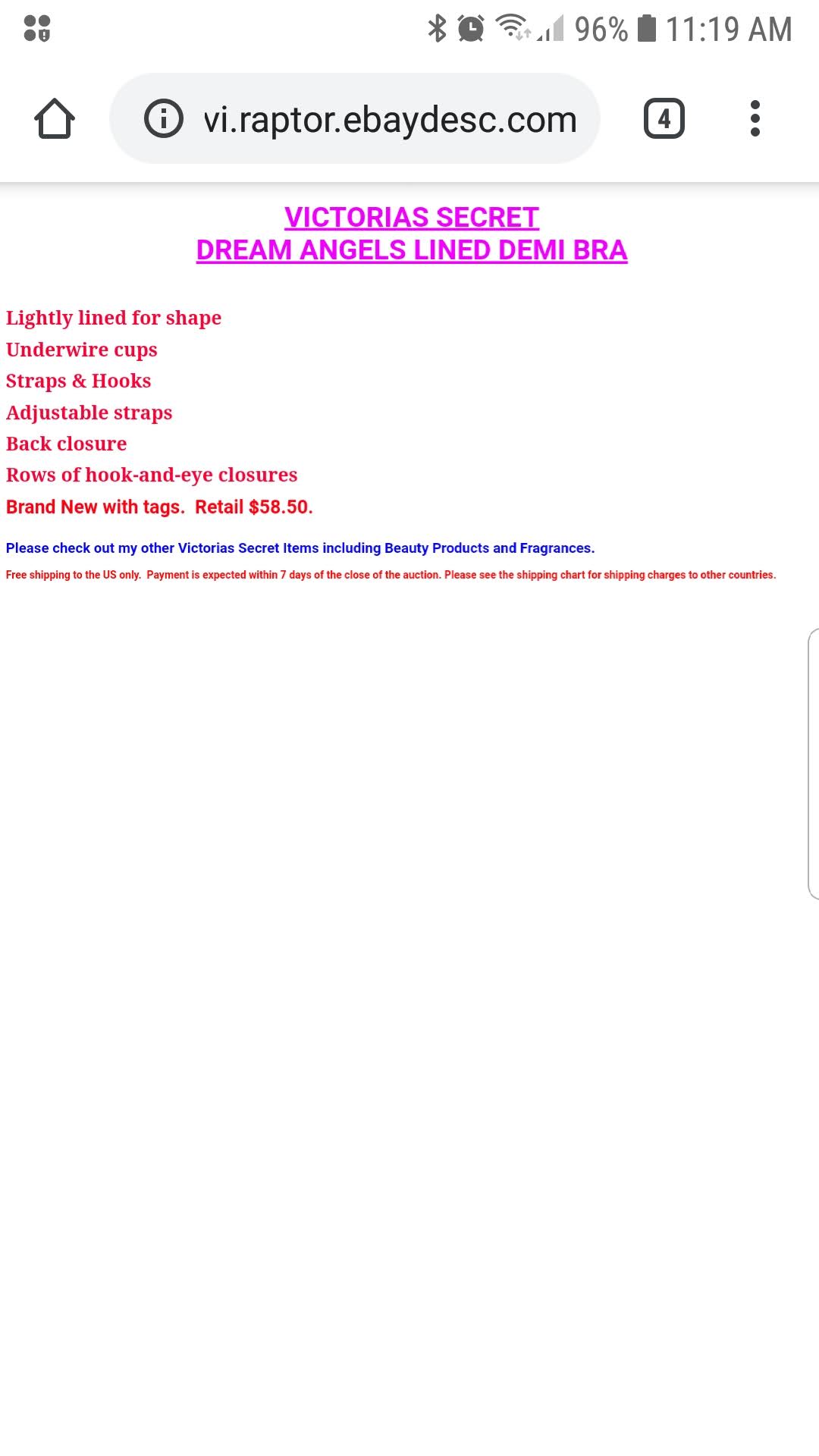
As you will notice, you CAN read the Red Bold Font, but the information under the font is in such a small print that it's literally impossible to read. When I opened this listing on a desktop pc I was able to see that the small text specifies that the item Ships for FREE inside the USA! This is very valuable info! In fact, Free Shipping is one of the most important factors for a woman when making a purchase!
The more junk you put in your listing “Details Section” , such as this:

Or this:

(GIF animations, embedded images, etc) the longer it takes to load, the more it freezes and the less it works. Many eBay sellers are embedding images that are not formatted for cell phones, so the image is 10x larger than the phone screen. I'm sure you have opened a listing that has blown out your screen... annoying!
Additionally, many sellers focus on their return policy and other details while skimping on the items details. I'm NOT knocking this seller, but look at this listing on a cell phone. It is 4 PAGE SCROLLS long and literally only 1 sentence describes the shirt being sold (in addition to sounding like Hitler):
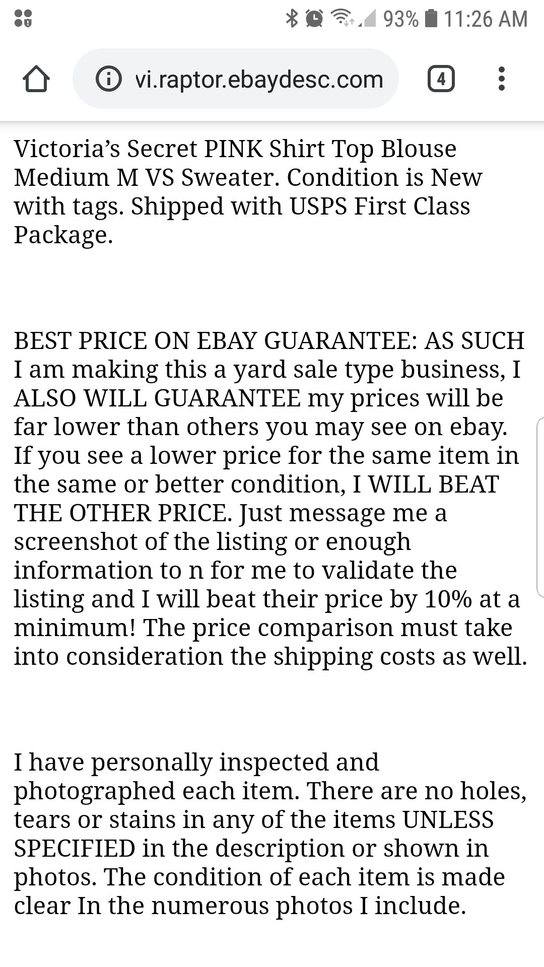
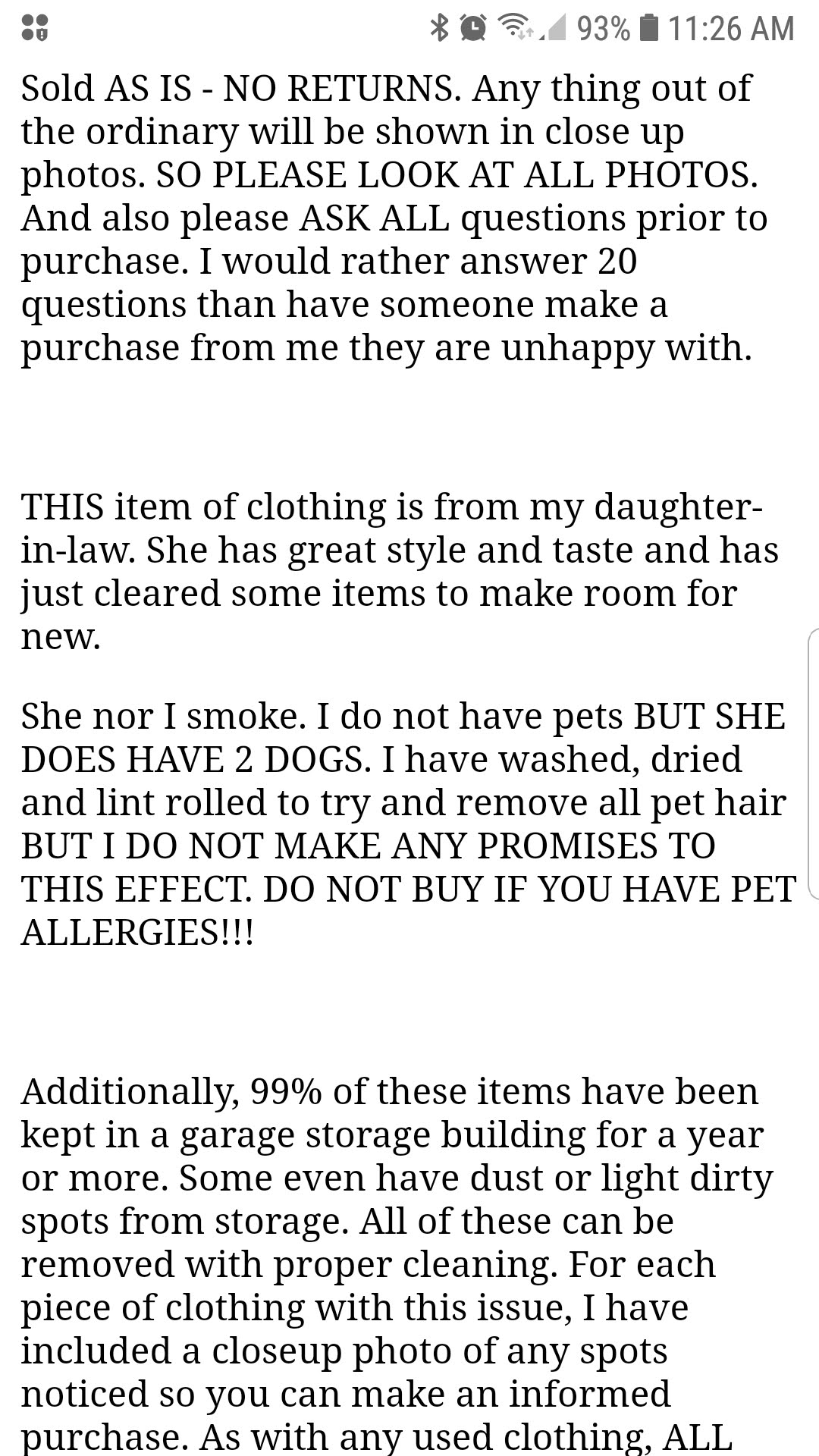
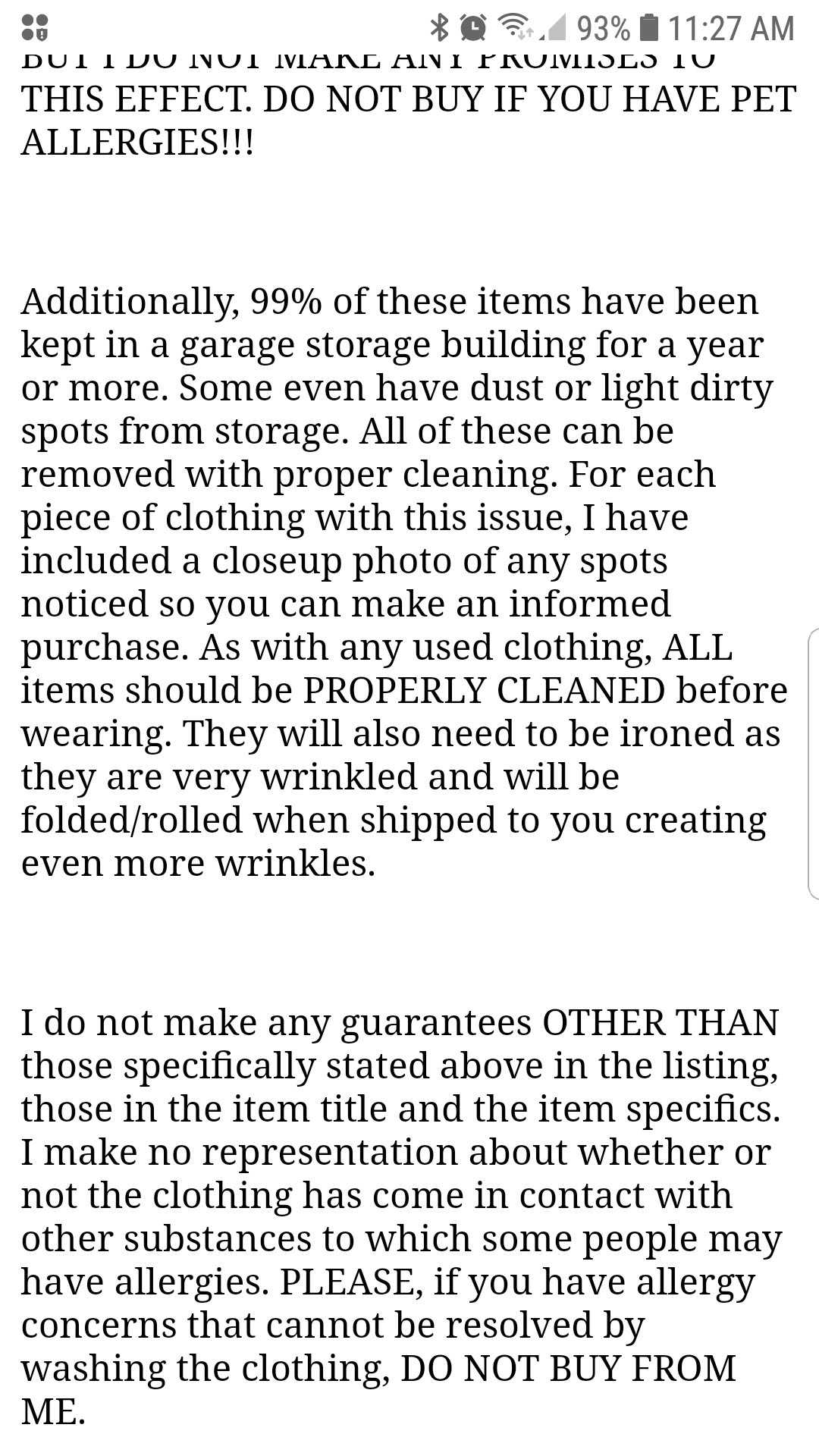
Let me ask you this: did YOU read all of that? Or did you start reading it then skip down to this section? If you skipped down to this section.... so do the potential buyers. It's way too much info about policies and not enough info about the shirt! If you did read all of this sellers policy info you still don't know what material composition the garment is, if it fits below-or-above the beltline, if it fits loose or tight... heck, all you know is that it's a used size Medium.
INSTEAD....
The best thing you can do is look at any big company, let’s say “Macys.com” for example. Look at how basic and boring their listings are:
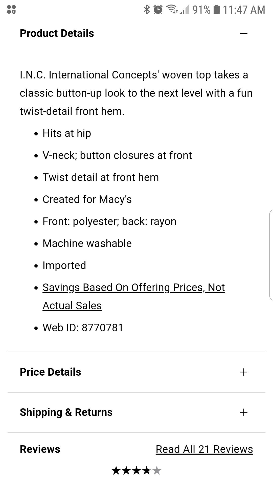
It’s just details, photos and price. The important details are always on top, followed by additional details if the buyer wants to read them. Macys does not employ flashing graphics, Comic Sans font, weird colors, ALL CAPS TO MAKE SURE YOU UNDERSTAND THAT YOU NEED TO READ ALL OF THESE DETAILS ON THIS PAGE BECAUSE WITHOUT TYPING IN CALL CAPS YOU MIGHT NOT SPEND THE TIME STRAINING YOUR EYES TO READ PARAGRAPHS OF INFO, Giant boldface Underlined Highlighted text, etc.
According to Google, one of the most important things you can do if you are an eCommerce seller is bullet point lists with the key important factors. In fact, Google specifically states do NOT write paragraphs of text because it decreases the “User Experience” (AKA: “UX”). Buyers like bulleted lists, and this is proven because literally all big online sites use them.
In closing...
Look at my closing paragraph written 3 different ways. First, let's look at the correct, steam lined method:
- View your listings from a cell phone. In fact, view your listings from other types of cell phones because all phones display differently.
- Use Bulletpoints for the summary most important information.
- Keep your most important info in the bullet points. Add all additional details to a sub-section.
- Product details are more important than after-sale-issues, such as returns. If nobody buys the item you'll never have to worry about a possible return
Next, let's look at the exact same closing, but without bullet points:
View your listings from a cell phone. In fact, view your listings from other types of cell phones because all phones display differently. Use Bulletpoints for the summary most important information. Keep your most important info in the bullet points. Add all additional details to a sub-section. Product details are more important than after-sale-issues, such as returns. If nobody buys the item you'll never have to worry about a possible return.
And lastly, let's look at the same closing, but let's use a colored, bold font:
View your listings from a cell phone. In fact, view your listings from other types of cell phones because all phones display differently. Use Bullet points for the summary most important information. Keep your most important info in the bullet points. Add all additional details to a sub-section. Product details are more important than after-sale-issues, such as returns. If nobody buys the item you'll never have to worry about a possible return.
It's pretty easy to see, when you compare the 3 variations, why bullet points are favored by Google, big stores and shoppers in general. :)
Recent Posts
-
WhatNot LIVE AUCTIONS LIQUIDATION EVENT! October 15th - Nov 12th!
We are doing a MASSIVE liquidation auction event on WhatNot! Every TUESDAY from October 15th thr …2nd Oct 2024 -
MASSIVE NEWS! 4 HUGE UPDATES Coming to Big Brand Wholesale.com!
We have TONS of exciting news! Check out our Facebook video from July 12th 2024 (below) then keep r …22nd Jul 2024 -
3 COMPANIES PRETENDING TO BE BigBrandWholesale.com! DO NOT ORDER THROUGH IMPOSTERS!
IMPOSTERS! BE CAREFUL!! DON’T BE FOOLED! We now have at least 3 different people PRETENDING to …23rd Dec 2023

