7 Reasons Why the New Facebook Update is TERRIBLE for Businesses!
So, I’m sure you’ve seen it by now... the new Facebook interface that unwantedly came in late August 2020. Ever since the “Update” we have had endless problems performing the most simple business tasks on their site.
BUT first, before you try to blame my internet connection, let me show you that I have a perfect connection:
Now that we are on the same page, let me tell you that I have more beefs with this new platform than the Clearance area in Aldis meat section. I am seriously a pissed off mofo and debating if advertising makes sense at this time because I am seeing people abandon FB due to total confusion.
PROBLEM 1: Inability to Check Messages and Comments
Facebook, for some reason, is a very popular way for our buyers and potential buyers to contact our business:
BUT, now when we try to check messages and such we receive consistent “Service Unavailable” Errors for no specific reason:
:
So, since we cannot access our Message Panel, the customer inquiries sit, and sit, and sit… then we get nailed with the infamous Facebook “slow response time”. We used to have the “fast reply badge” but that’s long gone now. It took us 4 DAYS to be able to access the most recent inquiries.
PROBLEM #2: The “Ad Center” often isn’t there. Like, you can click the link to go to it, but it’s just basically blank:
PROBLEM #3: Errors when CREATING ADS! Sweet baby Jesus, it’s now SO DIFFICULT to create a friggin ad. Even ads we have previously ran that we want to simply renew trigger endless errors. This is the most common error message, however it does not explain how to fix it, or even what specifically is causing the error.:
PROBLEM #4: But after you get this “ObjectStorySpecRedundant” error (shown above....whatever the F that means), 30-45 minutes later you get an email stating your ad IS running… so this entire time you have been been trying to troubleshoot this stupid error for no reason:
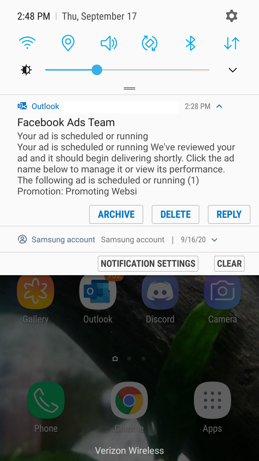
PROBLEM #5: Ad center does not function correctly; blank space, inability to use the interface…. Just terrible as a whole.:
PROBLEM #6: It’s not only confusing, but a total eye-sore. Look at this, does this seem pleasing to your eyes?? There’s overlapping text on top of images, super-tiny fonts, 3 rows of gibberish in addition to a top panel…. All I want to do is POST AN AD!!!!:
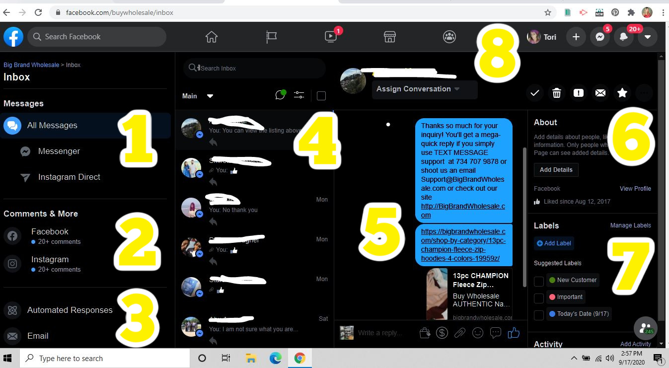
PROBLEM #7: If all you want to do is reply to customer comments and inquiries; now you have 7 panels to deal with plus 1 top-navigation-bar to figure out. Look how insane this is for someone who just wants to simply respond to customers (I have numbered each panel):
The craziest part is that, as an online business, we continually strive to make “Checkout” quicker, easier and less clicks. Facebook decided to increase the amount of click, decrease speed and make the overall new platform a lengthy process.
UPDATE: I finally figured out how to get rid of the terrible "Dark Mode". I also got to switch back to the "old facebook" which I think is so amazing and simple:
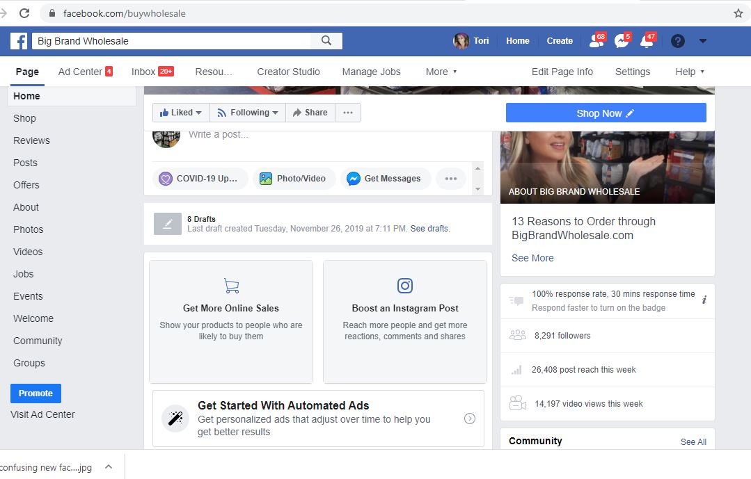
The reason I so totally love this is because everything I need is on the left side of the screen. Now let me point out; I was born pre-internet. I did not grow up with a phone in my hand. Even though I own an eCommerce site for a living, understand html and basic CSS, web banners, hyper-links, etc, for me, the above layout very easy versus this:
But maybe you're looking at me and thinking "Okay, Boomer" - even though I'm not a Boomer (I'm a Gen X), but if you feel that I'm just "too old" to get it, our average buyer is ages 24 - 45; and 23% of online shoppers fall between the ages of 35 and 44, while only 18% of the US population is that age... which happens to mean that online shopping is hugely populated by Millennials and Gen X'ers. In fact, GenX tends to love shopping online.... So, if a GenX who does understand html and basic coding can't figure out how to post a new FB ad.... Houston, we have a problem! Or... more so, an error message.
.
Recent Posts
-
WhatNot LIVE AUCTIONS LIQUIDATION EVENT! October 15th - Nov 12th!
We are doing a MASSIVE liquidation auction event on WhatNot! Every TUESDAY from October 15th thr …2nd Oct 2024 -
MASSIVE NEWS! 4 HUGE UPDATES Coming to Big Brand Wholesale.com!
We have TONS of exciting news! Check out our Facebook video from July 12th 2024 (below) then keep r …22nd Jul 2024 -
3 COMPANIES PRETENDING TO BE BigBrandWholesale.com! DO NOT ORDER THROUGH IMPOSTERS!
IMPOSTERS! BE CAREFUL!! DON’T BE FOOLED! We now have at least 3 different people PRETENDING to …23rd Dec 2023

